A Creator's Guide to Accessible Content: Captions, Alt Text, and Inclusive Design
Captions, alt text, and readable design are not extras. They are the difference between content people can use and content people abandon — and they grow your audience.
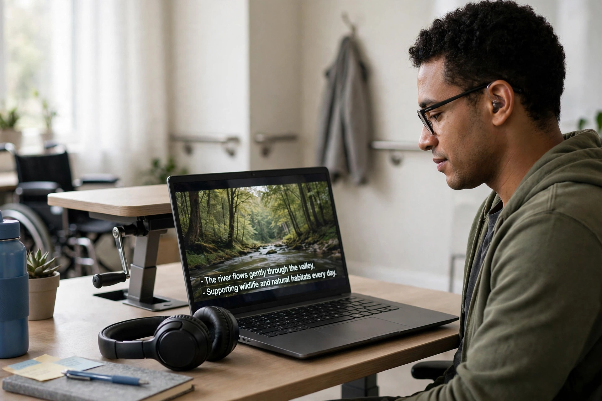
Accessible content is content more people can actually use. Captions help viewers watching on mute in a noisy bus. Alt text lets a blind listener understand your thumbnail. Readable design helps a viewer with dyslexia finish your article instead of abandoning it halfway. Accessibility is often framed as a kindness or a compliance chore. For creators, it is also simple good sense: every barrier you remove is an audience you keep.
Captions: The Highest-Impact Habit
Captions are the single most effective accessibility habit a creator can adopt, and they help far more people than the deaf and hard-of-hearing community alone. A large share of social video is watched with sound off, and viewers decide within seconds whether to stay. Captions give them a reason to stay, and they make your content searchable and quotable in ways audio alone never is.
Auto-captions are a starting point, not a finish line. They mishear names, technical terms, and accents, and an error in a key sentence can reverse your meaning. Review the captions for every published video, fixing names and numbers at minimum. If you speak in Hinglish or mix languages, check that the caption tool handled the switches; most tools struggle with mixed language and need manual correction. Burned-in captions work everywhere but cannot be turned off; platform captions can be toggled but depend on the platform. For short-form video, burned-in styled captions are usually the safer choice.
Alt Text: Describe the Point, Not Just the Picture
Alt text is the short description a screen reader reads aloud when it reaches an image. The most common mistake is describing the image literally — a woman smiling at a laptop — when the point of the image is something else, such as a creator celebrating her first sale. Good alt text answers one question: what information does this image carry that a listener would miss without it? If the image is decorative, say nothing, or mark it decorative where the platform allows; a screen reader reciting a description of every stock background photo is an annoyance, not a help.
Write alt text for thumbnails, infographics, and any image containing text. Infographics are the worst offenders: a chart full of numbers with no alt text is a locked door. Either summarise the chart's key finding in the alt text or put the full data in the post text itself. The same applies to screenshots of tweets or quotes: if the words matter, they must exist as real text somewhere, not only inside a picture.
Readable Design: Typography Is Accessibility
Many creators lose readers to design choices they never notice. Small grey text on a white background looks elegant and reads terribly for older viewers and anyone with low vision. The fixes are unglamorous: body text large enough to read on a phone without zooming, strong contrast between text and background, and line spacing that lets the eye track from one line to the next. Avoid long walls of text; short paragraphs and clear headings help every reader, and they are essential for readers who use screen readers to jump between sections.
Colour deserves special care. Never use colour alone to convey meaning — a red versus green chart, or instructions like click the green button — because colour-blind viewers cannot tell them apart. Pair colour with a label, an icon, or a pattern. Avoid flashing or rapidly strobing effects in video, which can trigger seizures; if a clip has flashing lights, warn viewers before it or cut it. These are small decisions that cost nothing and prevent real harm.
Audio and Video Beyond Captions
For longer videos, captions alone are not the whole story. Audio description — a voice track describing important visual action during pauses — matters for viewers who cannot see the screen, though it is rarely expected from small creators. A practical middle step is to narrate what you are doing while you do it. Instead of silently clicking through a tutorial, say what you are clicking and why. This habit, called self-describing presentation, helps blind viewers, helps listeners who are only half-watching, and improves your content for everyone.
Transcripts are the other underused tool. A transcript of a podcast or long video lets deaf viewers read the whole episode, lets search engines index it, and lets any viewer find the exact minute they need. You do not need a perfect transcript; a corrected auto-transcript published alongside the episode is already a major improvement over nothing.
Making Accessibility Part of the Workflow
Accessibility fails when it is a last-minute chore. It succeeds when it is a checklist step before publishing. Add five items to your publish checklist: captions reviewed, alt text written for meaningful images, contrast checked, colour not the only signal, and key information available as real text. The first few times this takes fifteen extra minutes. Within a month it takes five, because you start designing accessibly from the start: choosing readable fonts, describing images as you create them, and narrating actions as you record.
Accessibility also grows your audience in ways analytics rarely show. A viewer who watches your captioned videos on mute becomes a subscriber. A listener who reads your transcripts recommends your podcast to a friend who cannot hear it. A reader who can actually finish your article shares it. None of them appear in analytics as accessibility wins, but all of them are.
Frequently Asked Questions
Is accessibility only for creators with large audiences?
No. Small creators benefit most, because every viewer counts more at small scale. Losing one viewer in ten to an unreadable design or missing captions is a bigger relative loss for a small channel than for a large one.
Are auto-captions good enough?
They are a start, but unreviewed auto-captions regularly mishear names, numbers, and mixed-language speech. Reviewing and correcting them is the difference between accessible and approximately accessible.
Does alt text help with search rankings?
Alt text primarily serves screen reader users, but descriptive alt text also helps search engines understand images. Treat search benefit as a bonus, not the reason; the reason is the listener.
What if I cannot do everything at once?
Start with captions and alt text. Those two habits cover the largest number of people with the least effort. Add readable design checks next, then transcripts for long content.
Conclusion
Accessible content is not a separate kind of content. It is the same content with the barriers removed: captions reviewed, images described by their point, text readable on a phone, colour never the only signal, and actions narrated as they happen. Build those five habits into your publish checklist and your audience will quietly grow to include everyone you were accidentally excluding.
Related Marketplace Assets
AI Content Writer
Generate clear, well-structured articles, essays, creative drafts, and multi-paragraph content tailored to your audience.
AI Blog Post Generator
Transform article titles and premise outlines into structured Markdown blog posts complete with headings and actionable takeaways.
AI Text Rewriter
Polish drafts, improve clarity, and adjust tone without losing your original meaning or critical facts.